It’s no secret that the internet is a visual place. There is just no way around it. Web design, while certainly important from an aesthetic point of view, encompasses so much more than just painting a pretty picture for readers. Readers will judge you based on the quality of all aspects of your blog, not just your content!
So, if you want to take your blog to the next level, you need to start building a ‘brand’ to go with it. Creating a visual style guide is one of the best ways to do that.
You might have an amazing post that you’ve spent hours carefully crafting, but if you don’t work on presentation, it might not connect with the reader. Just think: did you spend any time considering how it will look or feel?
So what is a style guide?
A style guide is one of the most essential documents that a brand can have. Why? Well, it ensures that the brand that you have spent time creating is consistent. This is especially important if more than one person is creating content.
Style guides contain all the information needed to create whatever type of content you are trying to produce. Having a style guide will positively affect your blog’s usability and increase visitor satisfaction.
As a content creator, you only have a handful of tools at your disposal. Style guide are there to help rather than confuse. To quote Dave Standen from Huffington Post:
‘Why don’t we all have useful, user-friendly web content style guides? (…) Style guides that help to emphasise the brand’s voice rather than dilute it.’
Anyone can create a blog, but a style guide might just be the secret weapon for creating a professional, memorable blog.
Canva – 50 Meticulous Style Guides Every Startup Should See Before Launching
Psychology of design: it’s all in the mind
Having badly designed posts on a badly designed blog puts a wall between you and your reader. The design and layout, including logo design, affect the reader’s mood and attitude, and will affect the readers’ browsing experience too. So, if you want to create an effective post, you need to play into the psychology of the reader.
Want evidence? A study by Joseph Putnam for the site Crazy Egg found that ‘of all the factors that were mentioned for rejecting or mistrusting a website, 94% were design related; only 6% were content related.’
Other design problems that led to readers’ mistrust included boring design, a complex layout, small print, too much text, a corporate appearance, slow loading times and intrusive pop-ups. (We write more about creating better pop-ups for your blog here).
Colour is another psychological element that you need to address in your style guide. Research has confirmed that ‘60% of people will decide whether or not they’re attracted to a message based on colour alone. How you use colour also affects the visibility of your brand and reinforces brand recognition by up to 80%.’
To quote a blog post from Shout Me Loud:
‘I’m sure you have visited a website where you have instantly [been] affected by the colour of it. Either it is far too bright and turns you off instantly or it is so plain that it just seems dull and there is no reason for you to stay around’.
You could spend forever fretting over every minute detail of your blog’s style, but sometimes just a few tweaks this area is all your need to cater better to your readers. Especially if you feel like a certain element of your site isn’t converting!
Nathalie Nahai – Web Psychology: The science of online persuasion
Time to treat yourself as a brand
If you want to create a stand-out blog, it’s time to treat your blog as a brand. As Karla Cook of Hubspot says:
‘The best brands stick in our brains because their presence is defined by the repetition of the same logo, fonts, colours, and images. Once we see them enough, they become instantly recognisable, bringing us a clear sense of reliability and security.’
This is exactly the thing you want readers to associate with your blog.
A style guide is the perfect way to make sure that your ‘brand’ isn’t diluted. In an interesting post from Creative Bloq they mention that most marketing agencies create style guides as a way to rationalise their creative choices and to show ‘that there really was a method behind the madness of the creative journey they [want to take consumers on]’.
‘Look on a style guide as being similar to a cook book which is full of brand recipes and ingredients that work well together and create a successful blend of flavours and tastes. It should allow for experimentation but clearly, explain where too much of the wrong type of ingredient will spoil the brand broth.’
HubSpot – 20 Stunning Examples of Brand Style Guides
Creating your own style guide: 3 things to think about
Before you start, it’s important to point out that your blog doesn’t need to be the most beautiful site in the world. It just needs to look good, and convey quality. Your blog needs to be organized, responsive, uncluttered and appealing to the eye.
Here are 3 things you should consider using as the basis of your visual style guide.
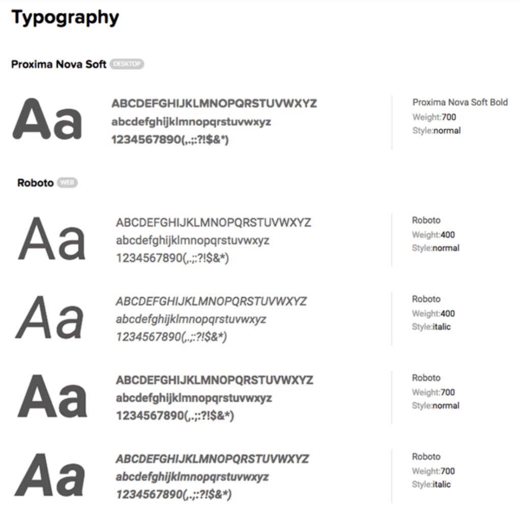
1) Typography
Web design is 95% typography, so choose the fonts for your blog carefully. Font legibility, formatting and line spacing are all things that typesetters have been considering for hundreds of years, and it is as relevant as ever for blogs.
In 2013, Smashing Magazine did some amazing research into the best practices of web typography, finding that ‘online publications have had to re-evaluate how their content is presented on mobile devices. Web typography is as rich, versatile and accessible as ever before.’
Headings
Research shows that the majority of people (6 in 10!) only read headlines on the Internet. If readers won’t even bother reading the body copy of your content then you need to make your headlines stand out, grab their attention and encourage them to read further!
Smashing Magazine found that serif fonts stand out in headlines, so consider using one of these. The two most popular typefaces for headlines were Georgia, used on The Guardian and the Financial Times, and Arial, found on Zeit.de and the BBC.
Text
The main body of your text is the most important part of your content (even if 60% of people just read the headline!). The font here should reflect and work in conjunction with the font for your headings, and fit with the overall story you are trying to tell with your blog.
According to the Smashing Magazine study, a whopping 61.5% of websites use serif fonts in their body copy.
As Butterick’s brilliant free eBook Practical Typography highlights, even the details matter:
- Point size – this is the size is your font going to be. ‘On the web, the optimal size is 15–25.’
- Line spacing – this is the vertical distance between lines of text – think about how you used to set your essays out! ‘For most text, the optimal line spacing is between 120% and 145% of the point size.’
- Line length – this is the distance between the left and right edges of a text block.
‘Shorter lines are more comfortable to read than longer lines. As line length increases, your eye has to travel farther from the end of one line to the beginning of the next, making it harder to track your progress vertically.’
‘Aim for an average line length of 45–90 characters, including spaces. You can check line length using word count.’
On a side note:
Smashing Magazine also found that a majority of websites used ‘non-standard fonts as their primary typeface’ — 39% of body copy and 66% of headlines.
This is an interesting development, because it shows that typography has become an important element in establishing brand identity and character. It also shows that you don’t have to follow strict rules; the number of people going outside-the-box indicates growing diversity on the web.
2) Colour
As I mentioned earlier, colours are really important. Do you know why is Facebook blue? According to The New Yorker, it’s because Mark Zuckerberg is red-green colour blind. This means that blue is the colour Mark can see the best: “Blue is the richest color for me; I can see all of blue.”
As Shout Me Loud puts it:
‘Colours have meanings for people which have been evolutionarily and socially enforced. These colours have just as much influence on the internet as they do in real life.’
Choose a colour theme that will subtly reflect the mood you want to create with your blog, and so affect your reader.
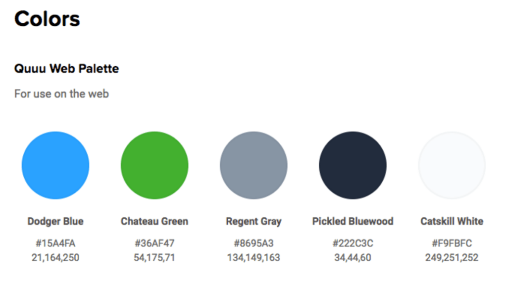
Start by choosing a limited colour palette. The Elle & Co blog has a really great in depth step by step guide to creating a distinct colour palette. Put simply, you need to decide on on 1-3 dominant colours and 3-5 secondary colours. These will be the colours people associate with your blog.
3) Photos & Infographics
Even if you’re a master wordsmith, you should be using images on your blog to engage your readers and make it easy for them to share the main takeaways from each blog post. There are tons of tools out there to help you edit photos and create infographics.
Every time that you use an image in a blog post make sure that it has a purpose. The image needs to be more than just decoration; it should add value, draw the reader in, or potentially clarify a point you are trying to make. It is possible for bad quality images to have a negative impact on your post, so if you’re not sure, ask for a second opinion.
Another key point is to make sure that you have permission to use the photos. If you are going to use mainly stock images, think of a way to edit them so they stick out from the crowd. A popular trend at the moment is adding a colour gradient overlay on a photo. You could also add your logo.
“Choosing the best images for your website isn’t just about sourcing ones that look good. We also need to think about how they’ll fit with your website design. This means thinking about your image size and and aspect ratio.” – Callia Web
Choosing the correct aspect ratio and image size also has a big impact on your site’s design; you can’t just throw any old images onto a site and expect it to look good!
These 3 points make a simple starting point for creating your own visual style guide. They should also help you move from ‘just another blog’ to a go-to, trusted source.
Have any extra tips for making sure your blog’s style is spot-on? Let us know in the comments




Very valuable points here which I will refer to again. It’s timely for me as I am currently struggling with the right image for my new blog post.