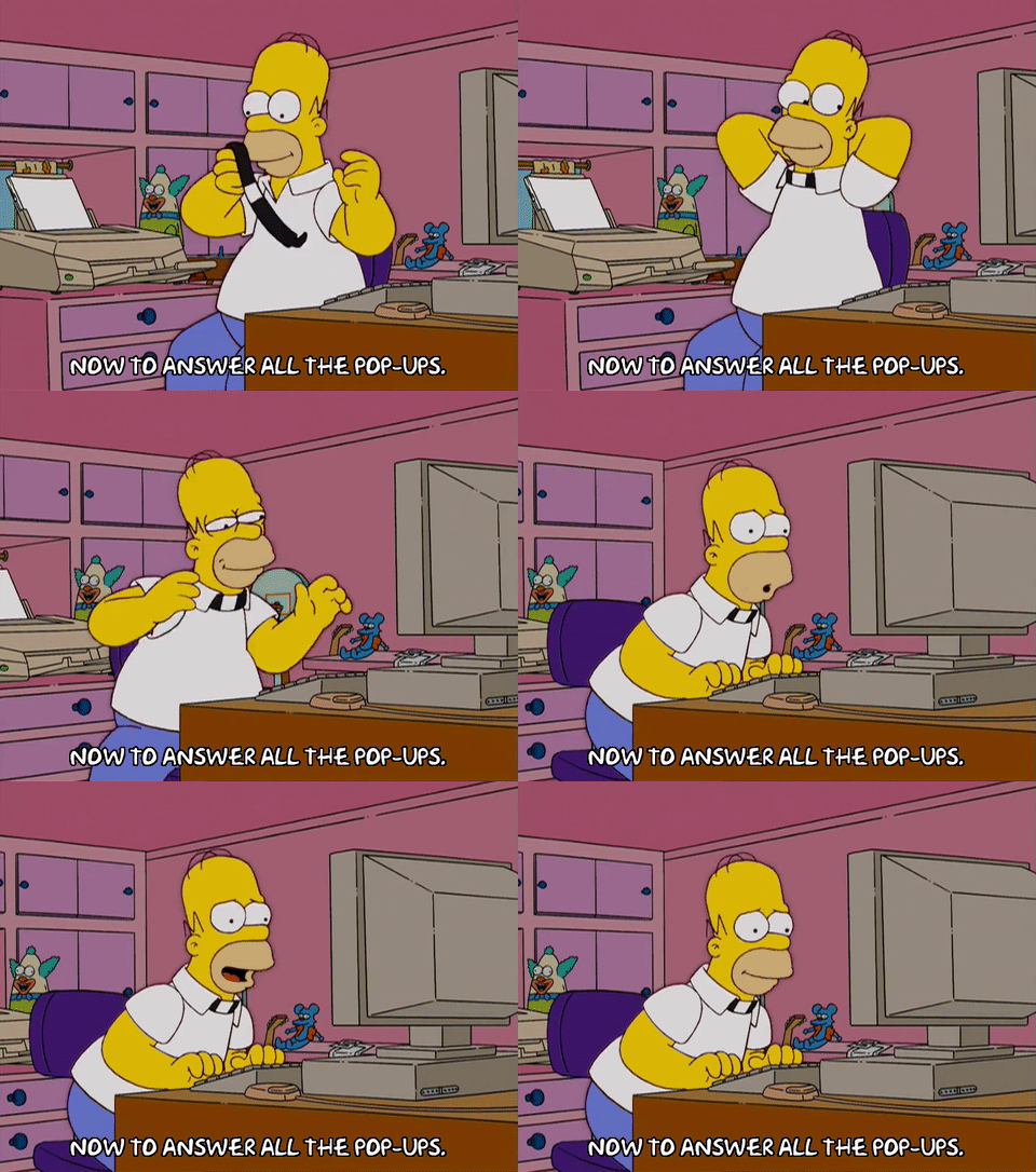
We read a lot of content here at Quuu. In fact, some days that’s all we do! And if there’s one thing we’ve noticed, it’s how easy it is to misuse a very common tool: pop ups.
We’ve all been there. You see a post that looks interesting, and decide to click on it. The page loads, but before you can get past the introduction, bam! A massive pop up comes up, totally blocking the content you wanted to read. Irritated, you find the intentionally-obscure ‘skip’ button (or worse, the ‘No, I hate my life’ button) and get back to the post.
Now, we’re not saying all opt-in forms are bad, period. On the contrary, they can be really effective tools, and many businesses rely on them. But, as with the above example, pop ups can also be jarring, and ruin the reading experience. And it seems we’re not alone in this feeling.
What marketers think
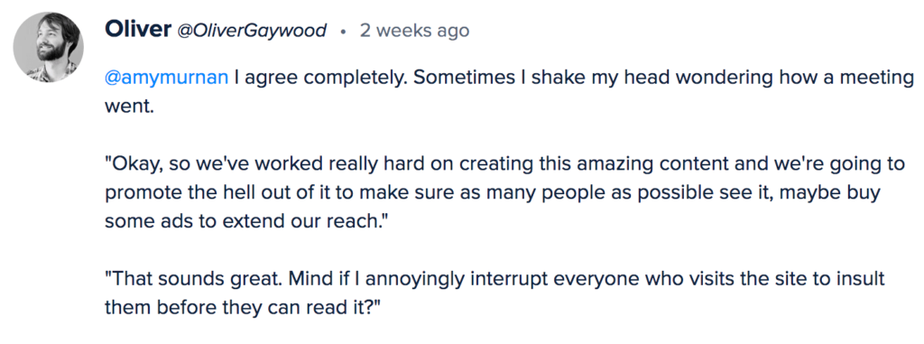
In a recent discussion on Inbound I saw lots of experienced marketers pitch in on this topic. Do the yes/no pop ups really work? Here are a few of the answers:
For a tactic that is so popular, opt-in pop ups don’t seem that beloved.
However, as Rob Marsh @brandstory pointed out, there is evidence they work – when they’re done right.
Blog pop ups that aren’t a buzzkill
So, what’s the difference between a pop up that works, and a pop up that perturbs? Here are some key tips for crafting your blog’s opt-in form.
Don’t provoke, insult, or shame your readers
It’s amazing this even needs to be said, but many opt-in pop ups, as Copyhackers puts it, on the ‘dark side of persuasion’. They leave the reader feeling patronised, or worse, like they’re being manipulated.
This typically comes in the form of ‘no’ buttons that are designed to induce the ‘Fear of Missing Out’. ‘No, I like losing money’ or ‘No, I have enough traffic’ are common examples.
While marketers may think this is a great tactic, they’re often forcing readers to click on a statement they probably do not agree with at all (because, let’s face it, not everyone will want to click ‘yes’). And when it comes to things like money, business, success, health or family, nobody wants to be told they don’t care enough.
There is a better alternative, though, and it works. In this post, Copyhackers shows how focusing on consequences boosted the results of their pop ups drastically – without the passive aggression!
Build a relationship
Website pop ups are often the first port of call when building a sales funnel. Add an opt-out form to your blog post and the sales will roll in, or so conventional wisdom says. However, it isn’t quite that simple.
Asking brand new readers to read your book, download your course or buy your product straight away is sort of like asking someone to marry you on the first date. They don’t know you, they probably don’t trust you, and quite frankly, why would they? You’re coming on a bit strong, which tends to make people suspicious.
However, offering something smaller, like a discount or a free worksheet, is more like asking them for coffee. They can size you up, see if they like you. And, once you’ve made a good impression (which, of course, you will), they’ll be much more likely to commit.

Timing is everything
Many capture forms come up as soon as you click on a blog post. This works well if you’re already an established brand or authority. People will recognise the name and think ‘cool, free resources from someone I trust!’ But if you’re still a fairly small outfit, you might be better off using a different ‘trigger’ for your capture form, like a short time lapse.
This has several crucial advantages. Firstly, your potential customer gets to read your content. This is important; if someone has clicked on your blog post, it’s because they actually want to read your blog post. Flashing a big pop-up onto the screen when they have no idea who you are is just going to annoy them; it’s one of the main reasons for a high bounce rate.
Secondly, it means that again, people get a chance to get to know you. Impress them with a great blog post, and they could be more likely to sign up.
As one Inbound respondent put it:
It’s important to conduct testing to see what works for your business – play around with different options.
Think about user experience
‘User experience’ is an approach used for designing websites, interfaces and apps. However, it’s also important when designing content, and accompanying capture forms. In the world of UX, capture forms are a type of ‘dialog box’, and mastering dialog design is essential to making them successful.
People often focus on timing as the biggest factor for a pop up, but small elements can also make a huge difference. In general, it’s a good idea to include:
- A minimal amount of information (a good CTA should suffice).
- A limited number of ways users can interact with the box.
- Clearly labelled buttons, including any yes/no options.
- An accessible exit button.
You can also improve your pop up’s success by paying attention to design. If your pop up looks like one of those ‘you have a virus’ ads from the early noughties, your readers probably won’t trust it.
And if a dialog box simply has too many fields, or is too confusing, that will easily put people off engaging with it.
As with our other tips, it’s all about putting yourself in your reader’s shoes. If you’d like them to feel positive when they visit your site, create capture forms and pop ups that help. Make them easy to understand, easy to navigate, and build from there.
Dive deeper into dialog design with this article from UX Planet.
Help, don’t sell
If you’ve ever tried to cold calling, you’ll know that people can spot a pitch from a mile off. As soon as that happens, they get defensive. And, to be honest, that’s understandable. Buying something from a stranger takes trust, and trusting people is risky. You have to have faith that they aren’t out to scam you.
Pop ups and capture forms have to overcome the same barrier. They have to look trustworthy and, just like any good salesperson, help the potential customer. This means focusing on whatever it is your offering does for the reader. It could inspire them, solve a problem, give them support, help them towards a goal…the list is endless.
I know – I harp on about this. But it’s truly one of the best ways to capture an audience’s favour and, ultimately, their custom!
Hopefully, these tips will help you make your capture form as effective as it can be. Do you have any other tips you’d add to the list? Let us know in the comments!


Reason I keep mine simple, and non-intrusive.
Great content will be implementing this for my website https://thecreativecomposite.co.uk you can check out (if you get time) what i currently do and what I will do now after reading this. Especially the opt-outs for blogs!